10/3/13 Drawing Conclusions
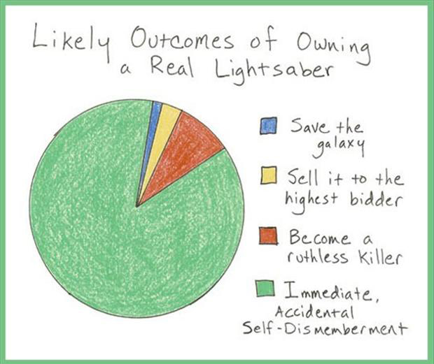
What conclusions can you draw from the following infographic?
|

Click to enlarge
|
Funny Graph Interpretation
|
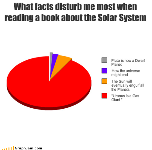
|

|
|
|

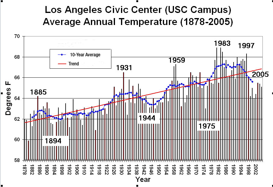
This graph looks complicated at first but is actually very easy to read.
1. What does the x-axis show?
2. What does the y-axis show?
3. Mr. D was born in 1975. What was the average temperature like that year?
4. What was the hottest year according to this graph?
5. What was the coldest year according to this graph?
6. What does that red trend line tell us about the average temperature in LA?
- No change
- It is increasing slowly
- It is increasing rapidly
- There is a slow decrease
- There is a rapid decrease
